

Storybook: Why, When and How
Published atComponent-based apps aren't news for nobody, libraries like React, VueJS, and Angular are basically our first options when we're creating a new project, it's because they are really good for us developers.
The Storybook is a library that allows us to divide our components, simulating your behavior, actions, properties, etc.
Ps: all examples here will be based on React. If you wanna see how setup using another library, check out that link.
Alright, are you starting your project, you enter your src folder and create a new file called Button.js, after that, you call this component inside your index.js file and open your browser to check the component. You'll repeat it every time that create a new one! Ok, it's not a problem if you are working alone or on a small project, but imagine that the project is big, or you are working with a team (most common case). If someone else needs to use your component, this person will need to open your Button.js file, and check the properties, styles, actions, etc. It's a painful process that cost time and of course, patience!
Setup
Alright, let's start a new create-react-app project:
1
$ create-react-app your_project &&cd your_projectAfter that, we can set up the Storybook by running the command:
1
$ npx -p @storybook/cli sb initNow you only need to run:
1
$ yarn storybookA local server will be created at http://localhost:9009 and you will see something like that:
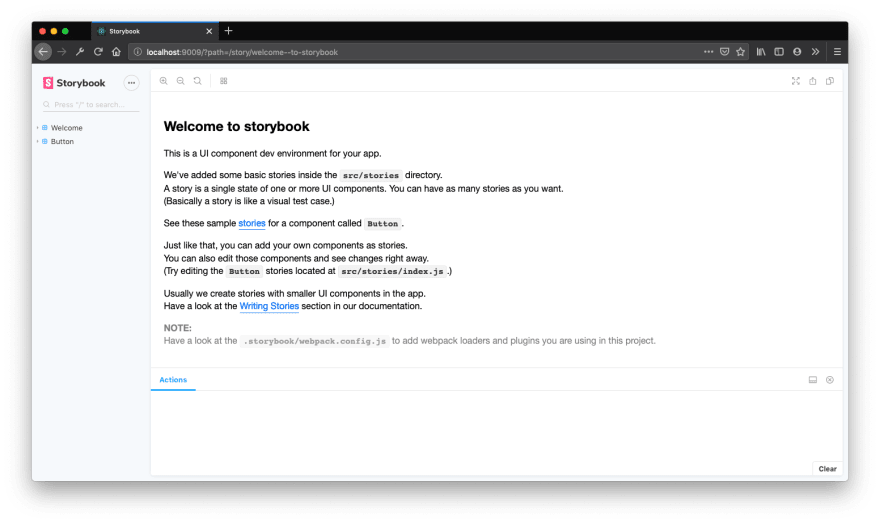
That's all you need to set up and run your storybook dashboard. Now, we'll check how you can add your own components to Storybook Dashboard.
Before we go to the next section, a folder called .storybook was created in your root project, that folder contains all the setup generated by the Storybook CLI, don't care about it now, we'll talk about it later.
Adding your own components
Now, after setup, go to the file src/stories/index.js, and you'll see something like that:
1
2
3
4
5
6
7
8
9
10
11
12
13
14
15
import React from 'react';
import { storiesOf } from '@storybook/react';
import { action } from '@storybook/addon-actions';
import { linkTo } from '@storybook/addon-links';
import { Button, Welcome } from '@storybook/react/demo';

storiesOf('Welcome', module).add('to Storybook', () => <Welcome showApp={linkTo('Button')} /> );

storiesOf('Button', module)
 .add('with text', () => <Button onClick={action('clicked')}>Hello Button</Button>)
 .add('with some emoji',() => (<Button onClick={action('clicked')}><span role="img" aria-label="so cool">
        😀 😎 👍 💯
      </span></Button>
)
);
Here you can check all the components that are showing at http://localhost:9009, all the components are registered here to be added to the Storybook Dashboard.
Ok, let's add a new component called Card.js inside our src/components folder.
1
2
3
4
5
6
7
8
9
10
import React from 'react';
import PropTypes from 'prop-types';
const Card = ({ title,description, }) => (<div><h1>{title}</h1><p>{description}</p></div>);
Card.propTypes = { title: PropTypes.string, description: PropTypes.string, };
Card.defaultProps={title:'Default Title',description:'Default Description',};
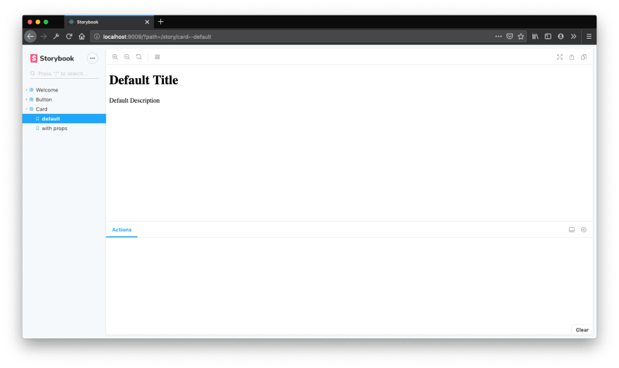
export default Card;Our Card component is so simple, the component receives two optional properties, title and description, if the component doesn't receive the props, it will show your default values already defined.
Now let's add our Card component to src/stories/index.js file.
1
2
3
4
5
6
7
8
...
import Card from '../components/Card';

...

storiesOf('Card', module)
.add('default',() => (<Card/>))
.add('with props', () => (<Card title="Lorem Impsum" description="Hi everyone" />))
The first thing that you need is to call the method storiesOf, that receive two params, the first one is the name of your story (or component) and, the second one is a param provided by storybook called module.
After that, I added a pipe called add, that receive also two params, the first one is the story name about the component (or expected behavior), I added "default" because I'm not passing any param, so I expect to see the default state of the component, the second one is the component, in this case, only calling the component without props. The second add pipe receives a different name and in this case, I'm calling the component with their props, now, if I open my dashboard, I'll be able to see the 2 expected behaviors from my component.
Add-ons
Alright, Storybook works fine, you now can divide your components and see them one by one separately, but if you were able to edit within the dashboard itself the properties of your component? or see the actions log? that would be great, right?
Storybook can do more than only see our components divided, with it we are able also to do more things like simulate actions, change our props on our dashboard, see jest updates, and accessibility, and change the state of your component (in React case), etc.
By now, I'll show how we can change our props and simulate actions. If you are interested in other add-ons, you can check them here.
Alright, let's update our Card component, now we'll add a button that will call a prop called onButtonClicked. Let's do it:
1
2
3
4
5
6
7
8
9
10
11
12
13
14
15
import React from 'react';
import PropTypes from 'prop-types';

const Card = ({  onButtonClicked, title, description }) => (<div>
<h1>{title}</h1>
<p>{description}</p>
<button onClick={onButtonClicked}>Click here</button>
</div>
);

Card.propTypes={ title: PropTypes.string, description: PropTypes.string, onButtonClicked: PropTypes.func, };

Card.defaultProps = { title: 'Default Title', description: 'Default Description', onButtonClicked: () => null,};

export default Card;
Now, let's back to our src/stories/index.js file and add a new prop to our Card Stories:
1
2
3
4
5
6
7
8
9
10
11
...

import Card from '../components/Card';
...

storiesOf('Card', module)
  .add('default', () => (<Card/>))
  .add('with props', () => (
     <Card title="Lorem Impsum" description="Hi everyone" onButtonClicked={() => { console.log("button was clicked")
}}/>
   ))
Now, if you open the Dashboard and click on the button, the console will show the message button was clicked. Alright, no news so far, let's first able our props to be edited using the dashboard.
The first thing that you need to do is install the addon-knobs module:
1
$ yarn add @storybook/addon-knobs --devAfter that, you need to change your .storybook/addons.js file:
1
2
3
import '@storybook/addon-actions/register';
import '@storybook/addon-links/register';
import '@storybook/addon-knobs/register';
Ok, now open you src/stories/index.js file and import the module and change the props title and description:
1
2
3
4
5
6
7
8
9
10
...
import { withKnobs, text } from '@storybook/knobs';
...

storiesOf('Card',module)
  .addDecorator(withKnobs)
  .add('default', () => (<Card/>))
  .add('with props', () => (
    <Card title={text('title', 'lorem impsun')} description={text('description', 'Hi everyone')} onButtonClicked={() => { console.log("button was clicked") } } />
  ))
If you check the details, I added a new pipe after the storiesOf method, the .addDecorator add the support to use knobs. The title and description props now are receiving a method called text, that receives as the first param the name of the property, and the second one is a default value, now, check your dashboard, and on the footer section, click on Knobs tab, you'll see that props are able to be edited! 🥳
Alright, let's track now the onButtonClicked action, to do that, we need to use the action module and change our prop on Card Component:
1
2
3
4
5
6
7
8
9
10
11
12
...
import {action} from'@storybook/addon-actions';

...

storiesOf('Card',module)
.addDecorator(withKnobs)
.add('default', () => <Card />)
.add('with props', () => (
   <Card
      title={text('title', 'lorem impsun')} description={text('description', 'Hi everyone')} onButtonClicked={action('button clicked')} />)
)
Now, back to your dashboard and select the table Actions, and try to click on the button. 🚀
Alright, as you can see, Storybook is a super library that can help us to create more productive and smart apps, this post was only an introduction and you can check more cool stuff and more integrations and their official page.
That's all folks, thank you for your time!


